

U.S. real GDP per capita shows how much inflation-adjusted economic output exists for each person in the United States. In my chart, the series begins near $1,633 in 1790 and reaches about $88,548 in 2024, both expressed in 2025 dollars. Therefore, this graph tells a long story about productivity, population growth, industrialization, wars, crises, technology, government policy and living standards.
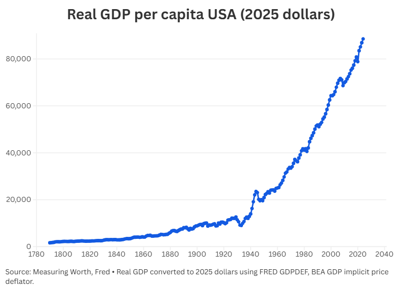
The data combines long-run historical U.S. GDP estimates from MeasuringWorth with a conversion to 2025 dollars using the FRED GDPDEF series, which is the U.S. GDP implicit price deflator from the Bureau of Economic Analysis. This method makes different years more comparable because it adjusts historical values for inflation.
What U.S. Real GDP per Capita Means
U.S. real GDP per capita measures real economic output divided by population. In simple terms, it estimates the average amount of inflation-adjusted production per person.
This measure differs from nominal GDP because nominal GDP uses current prices. Since prices change over time, nominal GDP can rise even when actual production does not improve. Real GDP corrects that problem by adjusting for inflation.
GDP per capita also differs from total GDP. A country can produce more because it has more people, but GDP per capita focuses on output per person. Therefore, this metric gives a better view of long-term changes in average economic capacity.
However, GDP per capita does not measure equality, happiness, health, leisure or median income. A country can have rising GDP per capita while many households still struggle with rent, debt, medical costs or low wages. For that reason, the chart should be read as a measure of average production per person, not as a perfect measure of quality of life.
Main Long-Term Trend: A Massive Increase Since 1790
The long-term rise is extraordinary. In the dataset used for the chart, U.S. real GDP per capita increases from about $1,633 in 1790 to about $88,548 in 2024. That means the level becomes more than 54 times larger over the full period.
This growth did not happen in a straight line. Instead, the chart shows waves of expansion, deep crises, wartime surges, postwar adjustments, inflation shocks, financial crises and recoveries. Over time, the United States became richer per person because workers used better machines, firms adopted new technologies, transportation improved, education expanded, capital accumulated and markets became more integrated.
In addition, the country moved from an agrarian economy to an industrial economy and then to a services, technology and knowledge-based economy. As a result, the same amount of labor could produce far more output in the modern era than in the eighteenth or nineteenth century.
Early Economic Growth: 1790 to 1860
The first part of the chart shows slow but important growth. U.S. real GDP per capita rises from about $1,633 in 1790 to about $4,086 in 1860. That represents an increase of roughly 150% before the Civil War.
Several forces supported this early expansion. Agriculture remained central, but trade, finance, canals, ports, roads and later railroads helped connect regional markets. Meanwhile, the country expanded westward, population increased and new cities grew.
However, this early growth also had deep contradictions. Slavery played a major role in the Southern economy, and many groups did not benefit equally from expansion. Because GDP per capita is an average, it can hide inequality, coercion and exclusion.
Industrialization and the Late Nineteenth Century
After the Civil War, the United States became more industrial. Railroads connected the country, factories expanded and urban labor markets grew. Steel, oil, machinery, electricity and mass production began to transform the economy.
Between 1860 and 1900, the chart shows U.S. real GDP per capita rising from about $4,086 to about $8,843. That means output per person more than doubled in four decades.
This period created much of the industrial base that later made the United States one of the largest economies in the world. Nevertheless, it also included financial panics, harsh working conditions, regional inequality and high volatility. Growth was real, but it was not smooth.
World War I and the 1910s
World War I affected the U.S. economy even before the United States officially entered the war in 1917. European demand for American food, raw materials, weapons and manufactured goods increased production. As a result, the U.S. economy experienced a wartime export boom.
According to NBER research, the U.S. economy entered the World War I period after a recession and then saw a strong expansion between 1914 and 1918.
In the chart, U.S. real GDP per capita rises from about $8,815 in 1914 to about $10,393 in 1918. That equals an increase of roughly 17.9%. However, the end of the war brought adjustment problems as the economy shifted back toward peacetime activity.
The Roaring Twenties: Growth Before the Crash
The 1920s look like a period of strong progress. U.S. real GDP per capita rises from about $10,192 in 1920 to about $12,604 in 1929, an increase of about 23.7%.
This decade included automobiles, electricity, radios, consumer credit, mass advertising, financial innovation and urban expansion. In addition, factories became more efficient, and mass production helped lower costs for many consumer goods.
However, the prosperity of the 1920s had weaknesses. Agriculture struggled after World War I, income gains were uneven and financial speculation increased. Consequently, the 1929 peak became vulnerable when confidence collapsed.
The Great Depression: 1929 to 1933
The Great Depression creates one of the most visible collapses in the chart. U.S. real GDP per capita falls from about $12,604 in 1929 to about $9,003 in 1933. That represents a decline of roughly 28.6%.
The NBER dates the business-cycle peak to August 1929 and the trough to March 1933. Federal Reserve History also explains that the Depression reached a severe point in 1933, when banking panic and financial collapse pushed the economy into extreme stress.
This decline was not a normal recession. Banks failed, prices fell, investment collapsed and unemployment surged. Therefore, the early 1930s show one of the deepest peacetime economic disasters in U.S. history.
Why U.S. Real GDP per Capita Grew Strongly From 1933 to 1938
The chart shows a powerful recovery between 1933 and 1938. U.S. real GDP per capita rises from about $9,003 to about $12,056, an increase of roughly 33.9%. That equals an approximate annual growth rate of 6.0%.
This rebound happened for several reasons. First, the economy started from an extremely depressed base. When output falls far below normal, unemployed workers, idle factories and unused resources can return to production quickly if demand improves.
Second, New Deal programs increased federal action in banking, employment, infrastructure and social support. These policies did not solve every problem, but they helped stabilize parts of the economy. Third, financial reforms restored some confidence after the banking collapse.
However, the recovery did not move in a perfect line. Federal Reserve History notes that a recession in 1937 interrupted the Depression recovery.
For that reason, the strong growth from 1933 to 1938 should be understood as a recovery from disaster, not as a normal boom from a healthy starting point.
World War II: The Acceleration From 1939 to 1944
The strongest acceleration in the chart happens during World War II. U.S. real GDP per capita rises from about $12,918 in 1939 to about $23,528 in 1944. That is an increase of roughly 82.1% in only five years, with an approximate annual growth rate of 12.7%.
World War II explains most of this jump. The federal government mobilized the economy for war. Factories produced aircraft, ships, tanks, weapons, vehicles and supplies. Millions of workers entered war industries, and unemployment fell dramatically.
Economic historians often describe World War II as one of the most important economic events in U.S. history because it changed production, employment, government spending and industrial organization.
Still, this wartime surge needs careful interpretation. GDP includes military production, so the increase did not mean ordinary families suddenly consumed twice as many civilian goods. In fact, rationing, military service, price controls and production controls affected daily life.
Therefore, the 1939 to 1944 acceleration shows the power of total wartime mobilization. It does not represent a normal consumer-led expansion.
Postwar Adjustment: 1944 to 1946
After 1944, the chart shows a decline. U.S. real GDP per capita falls from about $23,528 in 1944 to about $20,158 in 1946, a drop of roughly 14.3%.
This decrease happened because the war economy ended. Government military spending declined, soldiers returned home and factories converted from military goods to civilian production. As a result, measured output fell from the extraordinary wartime peak.
However, the United States did not return to Depression conditions. Consumer demand, housing, education benefits, private investment and suburbanization supported a strong postwar economy. Consequently, the long-run upward trend resumed after the adjustment.
The Korean War: 1950 to 1953
The Korean War produced another period of defense-related expansion, though much smaller than World War II. U.S. real GDP per capita rises from about $20,903 in 1950 to about $23,394 in 1953, an increase of about 11.9%.
NBER research on the Korean War expansion explains how defense mobilization influenced U.S. economic activity during the early 1950s. This period also created inflation pressure, since military spending increased demand for resources while the economy was already expanding.
Thus, the Korean War period shows a pattern often seen in wartime economies. Military spending can raise measured output, but it can also create pressure on prices and resources.
The Postwar Golden Age: 1953 to 1973
From 1953 to 1973, U.S. real GDP per capita rises from about $23,394 to about $37,159. That equals a gain of about 58.8%, with an approximate annual growth rate of 2.3%.
This period often appears as a golden age of U.S. economic growth. Productivity improved, manufacturing remained strong, suburbs expanded and highways connected markets. In addition, education levels increased, consumer credit grew and American firms benefited from a strong global position after World War II.
The economy also experienced rising demand for houses, cars, appliances and services. Meanwhile, Cold War spending supported defense industries, research and technology.
Nevertheless, the benefits were not equally shared. Racial discrimination, gender barriers and regional inequality limited opportunity for many Americans. Because of this, real GDP per capita shows average economic growth, but it does not fully describe social progress.
Vietnam War, Great Society Spending and Inflation Pressure
The Vietnam War period overlaps with the late 1960s and early 1970s. During this time, U.S. real GDP per capita continued to rise, but inflation pressures became more serious.
War spending, domestic programs and strong demand all affected the economy. In addition, the international monetary system faced pressure before the collapse of the Bretton Woods system in the early 1970s.
Federal Reserve History describes the Great Inflation as one of the defining macroeconomic events of the second half of the twentieth century. It lasted from the mid-1960s to the early 1980s and included high inflation, recessions, energy shortages and policy mistakes.
Therefore, the Vietnam era did not cause an immediate collapse in GDP per capita. However, it helped create the macroeconomic environment that made the 1970s more unstable.
The First Oil Shock: 1973 to 1974
The first oil shock hit after the 1973 oil embargo. In the chart, U.S. real GDP per capita falls from about $37,159 in 1973 to about $36,620 in 1974, a decline of around 1.5%.
This drop looks small compared with the Great Depression, but the economic meaning was important. Oil prices rose, inflation increased and unemployment became a larger problem. Economists used the term stagflation to describe the painful combination of slow growth and high inflation.
As a result, the first oil shock changed how policymakers thought about supply shocks. High inflation could occur even when the economy was weak.
The Second Oil Shock and the Early 1980s
The second oil shock occurred around 1979, after the Iranian Revolution disrupted oil markets. U.S. real GDP per capita reaches about $41,686 in 1979, then declines to about $40,583 in 1982. That represents a decrease of roughly 2.6%.
This period also connects to the Volcker disinflation. The Federal Reserve raised interest rates aggressively to fight inflation. Higher interest rates helped reduce inflation over time, but they also contributed to recessions in the early 1980s.
Consequently, the early 1980s appear as a pause in the long-run growth trend. The economy suffered in the short run, but lower inflation later created a more stable environment for the expansion that followed.
Recovery, Globalization and Technology: 1982 to 2000
After the early 1980s, the chart resumes a strong upward movement. U.S. real GDP per capita rises from about $40,583 in 1982 to about $64,376 in 2000. That equals an increase of roughly 58.6%, with an approximate annual growth rate of 2.6%.
Several forces supported this growth. Inflation declined, technology investment increased and global trade expanded. Computers, software, logistics, financial markets and telecommunications changed how firms operated.
In addition, the 1990s saw rapid internet adoption and strong productivity growth. Businesses invested heavily in information technology, and financial markets became extremely optimistic about future profits.
However, that optimism also created the dot-com bubble.
The Dot-Com Bubble and the 2001 Recession
The dot-com bubble burst around 2000, and the U.S. economy entered a recession in 2001. In the annual data, the decline in U.S. real GDP per capita looks very small. The series moves from about $64,376 in 2000 to about $64,347 in 2001.
The 2001 recession was relatively mild compared with the Great Depression, the Great Recession and the COVID recession. Nevertheless, the event still mattered because many technology companies failed, investment slowed and the Federal Reserve cut interest rates.
Therefore, the dot-com crisis became an important turning point between the 1990s technology boom and the credit-driven expansion of the 2000s.
Housing Boom and Financial Fragility Before 2008
After 2001, U.S. real GDP per capita started rising again. By 2007, it reached about $71,656 in the dataset. At first glance, the period looks like a normal expansion.
However, the economy became increasingly dependent on housing, credit and financial leverage. Mortgage lending expanded, home prices rose and financial institutions created complex securities linked to housing debt.
Federal Reserve History explains that the Great Recession followed a large housing boom and a major expansion in housing credit. Therefore, the pre-2008 rise in GDP per capita should not be interpreted as risk-free prosperity. Output was growing, but financial weakness was building underneath the surface.
The Great Recession: 2007 to 2009
The Great Recession appears clearly in the chart. U.S. real GDP per capita falls from about $71,656 in 2007 to about $68,628 in 2009, a decline of around 4.2%.
The NBER dates the Great Recession from December 2007 to June 2009. Federal Reserve History connects the crisis to housing, credit, financial stress and a broader collapse in confidence.
Compared with the Great Depression, the output decline was much smaller. Nevertheless, the crisis caused severe damage through unemployment, foreclosures, bank failures, lost wealth and slow recovery. Because of that, the Great Recession remains one of the most important economic events in modern U.S. history.
The Long Expansion After 2009
From 2009 to 2019, U.S. real GDP per capita rises from about $68,628 to about $80,834. That represents an increase of roughly 17.8%.
The expansion after the financial crisis lasted a long time, but many Americans experienced it as slow and uneven. Housing markets recovered at different speeds, wage growth took time to strengthen and productivity growth remained weaker than during the strongest postwar decades.
Even so, the chart shows a clear recovery. Output per person reached new highs before the COVID shock arrived.
The COVID Recession: 2020
The COVID recession caused one of the sharpest short-term contractions in U.S. history. In annual data, U.S. real GDP per capita falls from about $80,834 in 2019 to about $78,835 in 2020, a decline of about 2.5%.
The NBER dates the COVID recession from February 2020 to April 2020, making it extremely short by official business-cycle dating. The St. Louis Fed also explains that real GDP fell sharply in 2020 as the pandemic disrupted work, travel, services and supply chains.
Because this chart uses annual data, the 2020 drop looks smaller than the quarterly collapse. In other words, the yearly average hides some of the extreme short-term damage.
The Post-COVID Recovery: 2021 to 2024
After 2020, the chart shows a quick recovery. U.S. real GDP per capita rises to about $83,518 in 2021, $85,148 in 2022, $86,927 in 2023 and $88,548 in 2024.
Several factors helped the rebound. Fiscal support, monetary stimulus, reopening, remote work adaptation and labor market recovery all supported output. In addition, consumers shifted spending patterns, and many businesses adapted quickly to pandemic conditions.
However, the recovery also brought problems. Inflation increased, supply chains faced stress and the Federal Reserve later raised interest rates to control price growth. Therefore, the post-COVID economy combined strong recovery with serious inflation and policy challenges.
Key Periods in the U.S. Real GDP per Capita Chart
| Period | U.S. real GDP per capita movement | Main explanation |
|---|---|---|
| 1790 to 1860 | $1,633 to $4,086 | Early growth, agriculture, trade, canals, railroads and market expansion |
| 1860 to 1900 | $4,086 to $8,843 | Industrialization, railroads, factories, steel, oil and urban growth |
| 1900 to 1929 | $8,843 to $12,604 | Electricity, automobiles, mass production and consumer expansion |
| 1929 to 1933 | $12,604 to $9,003 | Great Depression, banking crisis, deflation and collapsing demand |
| 1933 to 1938 | $9,003 to $12,056 | Recovery from a depressed base, New Deal policies and stabilization |
| 1939 to 1944 | $12,918 to $23,528 | World War II mobilization and military production |
| 1944 to 1946 | $23,528 to $20,158 | End of wartime production and shift back to a civilian economy |
| 1950 to 1953 | $20,903 to $23,394 | Korean War defense spending and postwar expansion |
| 1953 to 1973 | $23,394 to $37,159 | Productivity growth, manufacturing, suburbs, highways and education |
| 1973 to 1974 | $37,159 to $36,620 | First oil shock and stagflation pressure |
| 1979 to 1982 | $41,686 to $40,583 | Second oil shock, high inflation and tight monetary policy |
| 1982 to 2000 | $40,583 to $64,376 | Disinflation, technology, globalization and productivity gains |
| 2000 to 2001 | $64,376 to $64,347 | Dot-com crash and mild recession |
| 2007 to 2009 | $71,656 to $68,628 | Great Recession and financial crisis |
| 2019 to 2020 | $80,834 to $78,835 | COVID recession |
| 2020 to 2024 | $78,835 to $88,548 | Reopening, policy support, labor recovery and continued growth |
What the Chart Shows About American Economic History
The chart shows that U.S. real GDP per capita grew enormously over more than two centuries. However, it also shows that growth depends on historical context.
Industrialization created the first major long-term rise. The Great Depression caused the largest peacetime collapse. World War II produced the strongest acceleration because the economy shifted toward total military mobilization. Later, the postwar decades brought productivity growth, mass consumption and rising output per person.
The 1970s interrupted that progress with oil shocks and high inflation. Afterward, the 1980s and 1990s brought recovery, technology adoption and globalization. The 2008 crisis revealed the danger of credit bubbles, while COVID showed how quickly a health crisis can become an economic crisis.
Even with these interruptions, the long-run trend remained upward. That is the most important message of the graph.
Final Interpretation
U.S. real GDP per capita in 2025 dollars helps explain how the United States moved from a small agrarian economy to a high-income advanced economy. The rise from about $1,633 in 1790 to about $88,548 in 2024 reflects productivity growth, capital accumulation, innovation, education, infrastructure and institutional development.
At the same time, the chart reminds us that economic growth is never automatic. Wars, depressions, inflation, financial crises and pandemics can change the path of output per person. Therefore, the line is not just a measure of GDP. It is also a historical record of how the U.S. economy responded to shocks, recovered from crises and transformed itself over time.
The strongest lesson is clear: American living standards increased dramatically in the long run, but each major jump or decline had a historical cause behind it.
Sources and Reference URLs
MeasuringWorth, historical U.S. GDP data:
https://www.measuringworth.com/datasets/usgdp/
FRED, GDPDEF, Gross Domestic Product: Implicit Price Deflator:
https://fred.stlouisfed.org/series/GDPDEF
Bureau of Economic Analysis, GDP price deflator:
https://www.bea.gov/data/prices-inflation/gdp-price-deflator
NBER, U.S. business cycle expansions and contractions:
https://www.nber.org/research/data/us-business-cycle-expansions-and-contractions
NBER, business cycle dating FAQ:
https://www.nber.org/research/business-cycle-dating/business-cycle-dating-procedure-frequently-asked-questions
Federal Reserve History, Great Depression:
https://www.federalreservehistory.org/essays/great-depression
NBER, Economics of World War I:
https://www.nber.org/digest/jan05/economics-world-war-i
EH.net, The American Economy During World War II:
https://eh.net/encyclopedia/the-american-economy-during-world-war-ii/
NBER, The American Economy During World War II:
https://www.nber.org/system/files/working_papers/h0077/h0077.pdf
NBER, The Korean War and economic expansion:
https://www.nber.org/system/files/chapters/c2909/c2909.pdf
Council on Foreign Relations, Korean War and inflation:
https://www.cfr.org/articles/what-korean-war-era-reveals-about-feds-inflation-dilemma
Federal Reserve History, Great Inflation:
https://www.federalreservehistory.org/essays/great-inflation
Federal Reserve, Bernanke speech on the 2001 recession and financial crisis:
https://www.federalreserve.gov/newsevents/speech/bernanke20100103a.htm
Federal Reserve History, Great Recession and its aftermath:
https://www.federalreservehistory.org/essays/great-recession-and-its-aftermath
NBER, Business Cycle Dating:
https://www.nber.org/research/business-cycle-dating
St. Louis Fed, COVID-19 effects on the economy:
https://www.stlouisfed.org/publications/page-one-economics/2020/08/10/covid-19s-effects-on-the-economy-and-the-feds-response







Pingback: The Science of Macroeconomics